Maps are an important tool in everyday life and can be used to display numerous bits of information. One type of map is called a thematic map. While maps can show a variety of things, thematic maps highlight a specific piece of information. There are many different types of thematic maps.
One type of thematic map is called a proportional symbol map. These maps use a symbol, usually a circle, to show intensity or frequency. The map below shows the population distribution in Canada in 1980. You can see that the most populated areas (Ottawa, Toronto, Winnipeg etc.) have the largest circles around them.
Another type of thematic map is called a choropleth map. These maps use colors and shading to show a measurement or amount of something in a certain area. The map below shows the population of children under fourteen in Canada in 2006. The more populated areas are shaded in the darkest green colors and as the shade of green decreases, the population decreases.
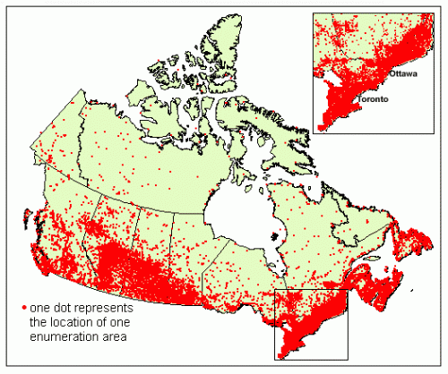
Another type of thematic map is called a dot distribution map. These maps use single dots to represent a certain amount in a certain area. The more dots together in an area, the more dense it appears on the map. In the map below showing population distribution in Canada, the red dots show population density.


No comments:
Post a Comment